Cyber system optimization
Redesigning SD-WAN for Clarity & Speed
Desktop | Year 2023
My Role UX & UI design
Overview
As part of Check Point’s ongoing efforts to improve usability in complex cybersecurity systems, I led the redesign of a key SD-WAN product dashboard used by IT managers across global logistics companies. The previous interface was cluttered and non-intuitive, which made it difficult for users to understand data flows and make fast decisions. The goal was to improve clarity, optimize workflows, and introduce a new Figma-based design system.
The Challenge
This cybersecurity system supports large-scale, multi-branch organizations. Users were struggling with an overwhelming interface, unclear status indicators, and inefficient workflows. The redesign needed to preserve the platform’s advanced capabilities while making it more approachable and readable for non-expert users.
Goal
To optimize the user experience of a legacy SD-WAN system by improving usability, visual hierarchy, and interface logic—while integrating a new component library and visual language into the platform.
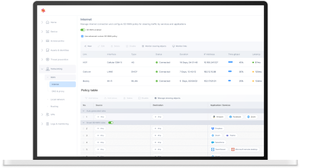
Internet & SD-WAN Policy – Key design highlights
Top Section – Data Interfaces Table
Clarity & scalability – Tables enable quick scanning and comparison between interfaces like Cellular, LAN, and Wi-Fi.
Logical structure – Each row represents a single interface, while columns present key metrics (e.g., status, IP, throughput)
Pattern recognition – A consistent format helps IT managers quickly identify underperforming links based on visual familiarity.
Bottom Section – Policy Table
(Smart SD-WAN Rules)
What the Policy Table displays:
- Traffic rules based on source, destination, application/services, and associated steering objects.
- Priority levels set for different apps (Zoom, Teams, Salesforce, etc.) across network paths.
Improvements made:
- Redesigned visual structure for hierarchy, grouping, and better line separation.
- Inline editing support – users can easily modify rules by clicking “Edit” or “Manage steering objects”.
- Smart SD-WAN toggle allows users to enable/disable auto-optimized routing instantly.
- Search and filter options help manage large rule sets efficiently.
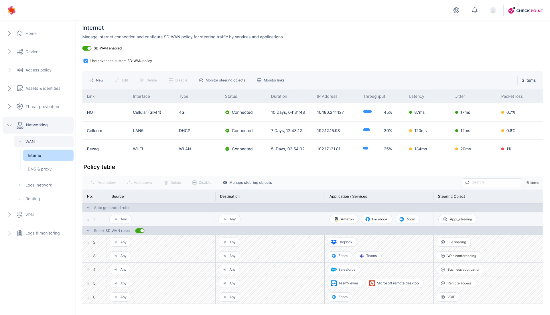
Steering Object Drawer
- Use of a side drawer (vs. modal or separate page):
Enables users to edit the object while still seeing the full context of the main policy table behind it. This minimizes cognitive load and keeps users oriented within the workflow.
- Clear separation of logical sections:
The drawer is organized into collapsible blocks—Thresholds, Object Candidates, Link Utilization, Probing—making complex data feel manageable and easier to navigate.
- Inline edit experience:
Allows users to update key attributes (e.g., latency, jitter, packet loss thresholds) without switching context or leaving the main page.
Use-case segmentation (link selection): By allowing the user to pick which interfaces (e.g., HOT, Cellcom, Bezeq) are used for this object, the drawer supports intelligent traffic steering per business priorities. - Save/Cancel CTA placement: Located at the bottom-right for easy access and familiarity, consistent with common UX patterns.
The persona

David Cohen
Age: 42
Job Title: IT Manager
Company: Horizon Logistics Solutions
Meet David, an experienced IT Manager at a logistics company, managing complex SD-WAN networks across multiple sites. He’s proactive, detail-oriented, and needs fast access to reliable data.
His goals:
Monitor and optimize network performance in real time
Prioritize traffic for critical business applications
Minimize downtime and security risks
Reduce manual work through smart automation
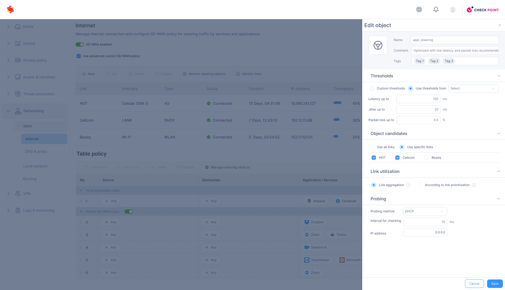
User flow- Edit a Steering Object
- Split-Drawer Structure Users can browse and edit objects in parallel using a two-level drawer, keeping the policy context always visible.
- Clear Object Hierarchy Steering objects are grouped by usage type (e.g. remote access, web conferencing), allowing intuitive filtering and organization.
- Inline Editing with Immediate Feedback Users can adjust thresholds, select links, and configure probing—all within the drawer—streamlining the workflow.
- Combined Search & Filtering Enables fast access to relevant objects whether the user prefers search or navigation by category.

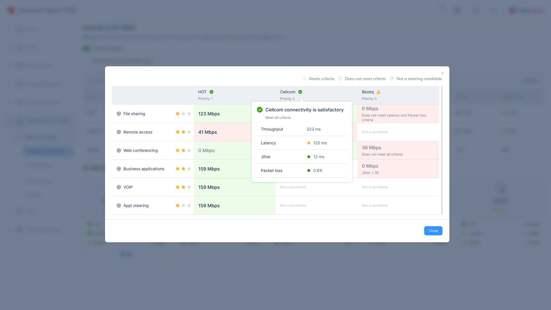
Compare Link Quality
This screen provides a real-time comparison of network links (HOT, Cellcom, Bezeq) for a selected steering object. Its purpose is to help users choose the best-performing connection based on predefined criteria.
The screen helps users evaluate and select the best network link based on real-time performance and predefined thresholds.
3 Key UI Comparison Elements
Clear color coding (Green / Red / Gray):
Instantly shows whether a link meets the defined thresholds without needing to read detailed text.Vertical layout by provider with clear headers:
Makes it easy to visually compare performance between HOT, Cellcom, and Bezeq in a clean, linear format.Detailed tooltips on hover or click:
Provides quick insights into each link’s performance and threshold status without leaving the screen.
Post-Launch Use Case – Real-World Evaluation
Scenario:
Two weeks after the updated SD-WAN interface went live, we observed how IT managers across multiple branches used the new steering object management flow in real conditions.
Goal:
To validate if the redesigned drawers, policy editing flow, and link comparison screens improved user efficiency and reduced errors during policy configuration.
Key Observations & Outcomes:
Faster Policy Updates
IT managers were able to complete full object edits in under 2 minutes—compared to 5–6 minutes in the previous version.Higher Accuracy in Link Selection
Thanks to the real-time color indicators and link metrics, users selected compliant links with fewer errors and less backtracking.Positive Feedback on Split Drawer Flow
Users appreciated the ability to browse and edit objects without losing sight of the policy table, reducing confusion in multi-step workflows.Confusion Around Terminology
Some users misunderstood labels like “Object Candidates” and “Steering Tags.” Based on this, we updated tooltip texts and improved field descriptions.
Result:
Overall, the design changes successfully reduced friction in day-to-day usage and helped less-experienced users complete tasks independently—without requiring additional training.