Cyber System Redesign
Redesigning a live cyber system
Desktop | Year 2023
My Role UX & UI design
Overview
This project focused on redesigning a live cyber system that is used daily by enterprise clients. The platform already had an active user base, so any change had to consider real user behavior, habits, and expectations. As the lead designer, I was also the first to start building the company’s Design System from the ground up. That meant designing every component from scratch and laying the foundation for a scalable, consistent UI across the product. My role was to take a complex and outdated interface and turn it into a cleaner, smarter, and more efficient experience—while keeping the core functionality fully intact.
The Challenge
Since the system was already in heavy daily use, we had to approach the redesign carefully. We received a lot of user feedback—not only about the visual look and feel, but also about the usability and logic of the flows. Users needed better clarity, simpler actions, and a smoother experience across screens. We couldn’t afford to disrupt their work, so every change had to be thoughtful and backed by real needs.
UX Goals
Our goal was to improve both the visual design and the user experience across the entire system. This included rethinking the structure of key screens, improving workflows, and reducing friction. In parallel, I led the creation of a brand-new Design System—this was the first project in the company to use it. Every component was carefully designed and documented to create consistency, scalability, and a better foundation for future features.
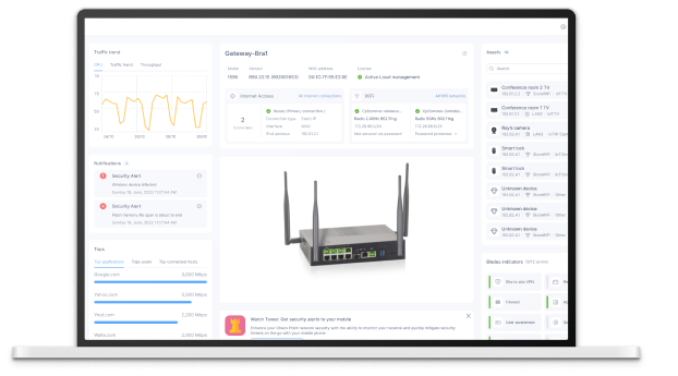
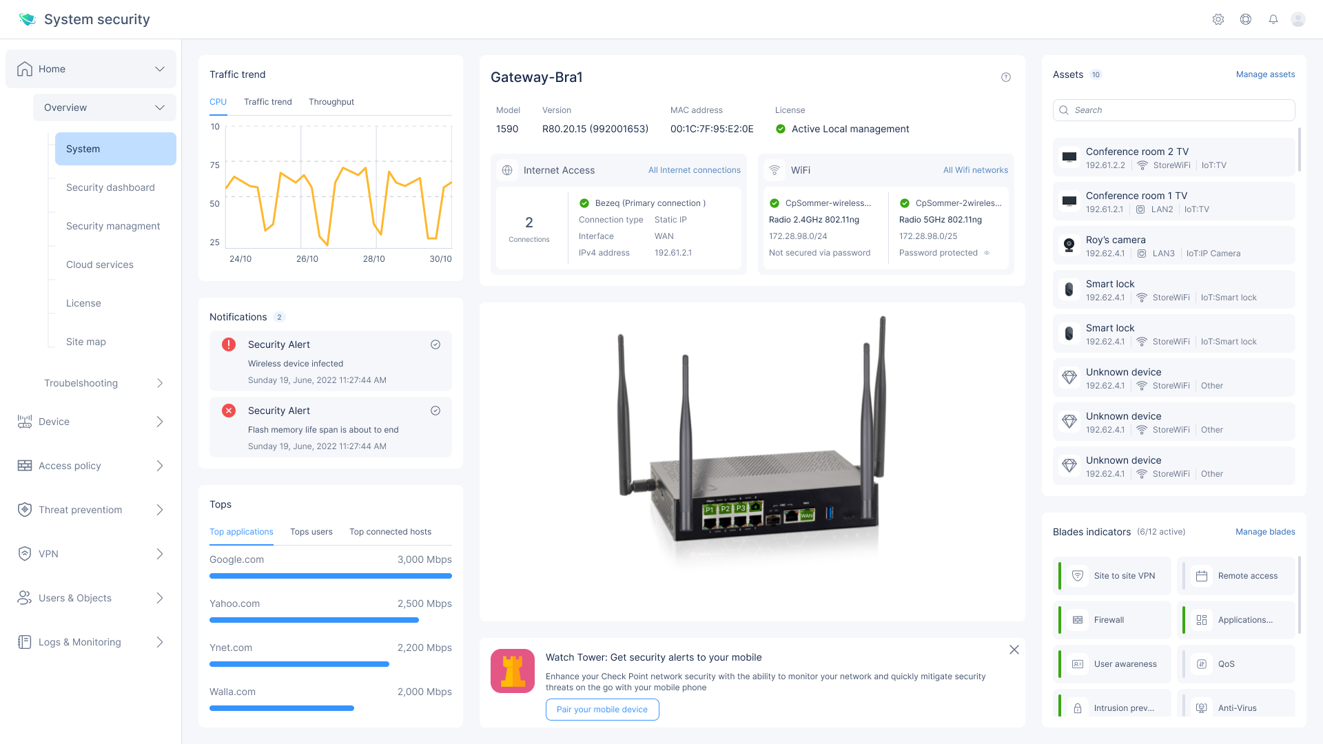
Old vs. New: System Dashboard Redesign
Old Design - Main UX Problems
Visual Clutter – Too much information is displayed with little visual hierarchy, making it hard to know where to focus first.
Poor Typography & Spacing – Small text, tight spacing, and inconsistent alignment reduce readability and scannability.
Unclear Grouping – Related data like network status, notifications, and activity aren’t visually grouped in a meaningful way.
Low Data Visualization Quality – Graphs lack labels, tooltips, and meaningful contrast, making them hard to interpret.
Side Navigation is Overloaded – The vertical menu includes too many items with similar icons and no separation between categories.
Outdated Design Language – The interface feels outdated, less intuitive, and visually dense compared to modern enterprise tools.
New Design - UX/UI Solutions
Visual Clutter- Clean, Structured Layout
Replaced dense blocks with clear cards and white space to improve focus and readability.Poor Typography & Spacing- Improved Readability
Larger font sizes, consistent spacing, and better alignment for quick scanning.Unclear Grouping- Logical Information Blocks
Grouped data by function (alerts, WiFi, assets, traffic, etc.) using modular cards and sections.Low-Quality Data Visualization- Simplified, Labeled Graphs
Used line charts with clear axis labels and titles; removed noise and added interactivity.Overloaded Side Navigation- Organized, Collapsible Menu
Grouped menu items by function with meaningful icons and collapsible sections for cleaner navigation.Outdated Look → Modern, Scalable Design System
→ Introduced a modern UI with a fresh color palette, icon system, and reusable components for consistency and future growth.
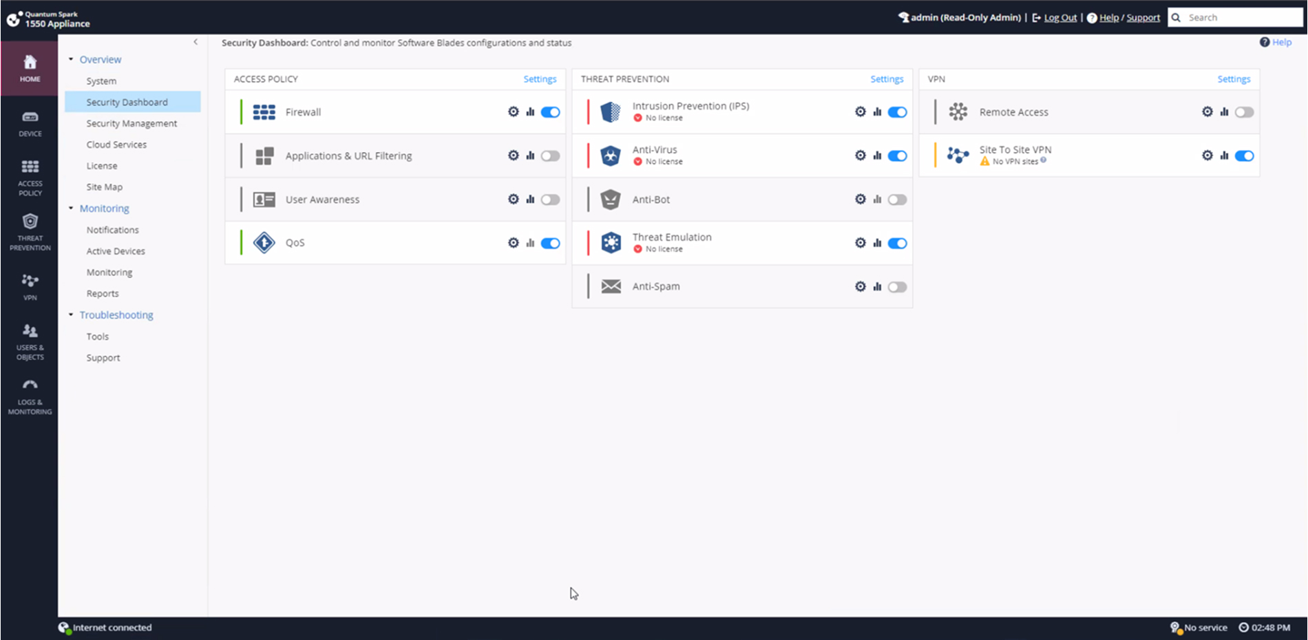
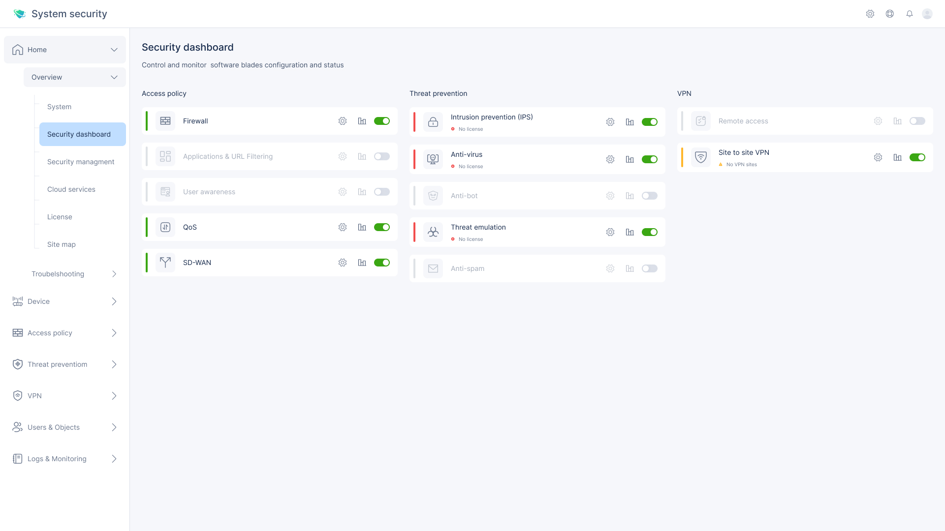
Old vs. New | Security Dashboard
Key Weaknesses
Visual clutter – Overuse of icons, inconsistent spacing, and unclear visual hierarchy made the screen hard to scan.
Flat structure – All software blades looked similar, with no visual separation between categories (Access Policy, Threat Prevention, VPN).
Inconsistent design elements – Mismatched icon styles, spacing issues, and inconsistent toggle/button behavior.
Poor status communication – It wasn’t always clear what was active, inactive, or disabled due to missing licenses.
New UI – Key UX/UI Strengths:
- Card-based layout
Each blade is presented as a separate card, making it easier to scan and digest information at a glance. - Clear status indicators
Toggles, icons, and color signals clearly communicate the license status and activation state of each feature. - Logical grouping
Blades are visually grouped by function—Access Policy, Threat Prevention, and VPN—reducing mental load. - Consistent actions
Every blade has the same actionable icons (settings, analytics, toggle), creating a predictable and intuitive experience.
Old vs. New | Local network
Key Weaknesses
Dense, outdated layout – Tight rows, small fonts, and minimal spacing made it hard to scan or focus on key data.
Lack of visual grouping – All elements were displayed as a flat table, with no hierarchy between switch and LAN items.
Low feedback clarity – Statuses like “Cable disconnected” or “Disabled” were shown in small icons with unclear priority or meaning.
Overloaded side menu – Too many unrelated items in the left panel with no visual separation or prioritization.
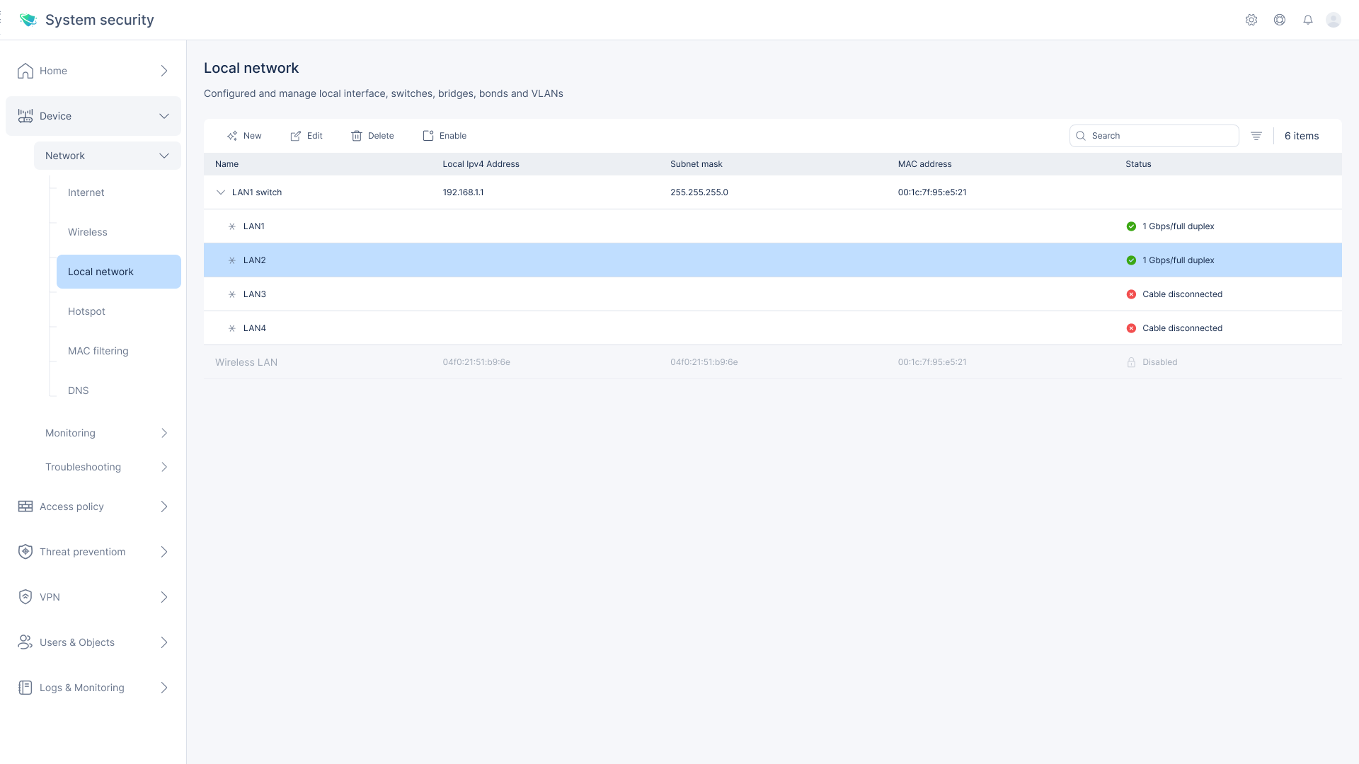
New UI – Key UX/UI Improvements:
Clear visual hierarchy
LAN switch and connected LAN ports are visually grouped to reflect logical relationships and simplify scanning.Enhanced status indicators
Text-based labels with colors (e.g. green for connected, red for disconnected) make states easier to understand at a glance.Spacious, modern layout
Increased padding, clean font usage, and a more structured table design reduce visual noise and improve readability.Streamlined interface controls
Centralized top-bar actions (edit, delete, enable) and simplified side navigation create a more focused and efficient user experience.
Before vs. After | VPN remote access control
Key Weaknesses
Cluttered visual hierarchy – All elements were stacked with similar styling, making it hard to distinguish between system messages, instructions, and actions.
Too much inline text – Long help links and configuration notes created visual noise and distracted from the main task.
Mixed control styles – Toggle buttons, checkboxes, and links were inconsistently styled and placed.
Confusing switch state – The global enable/disable control was visually detached from the configuration area.

New UI – Key UX/UI Improvements:
- Clear layout separation
Information is divided into clean sections—system status at the top, available access methods below—making it easier to digest and act on. - Reduced visual noise
Help and configuration guidance is simplified and displayed only when necessary, improving focus. - Consistent interaction model
All access options are presented as uniform checkboxes with clear labels and spacing, making it easier to select and compare. - Global status visibility
The main enable/disable switch is clearly presented at the top, making it obvious when VPN access is turned on or off.
The persona

Mark Stein
Age: 45
Job Title: IT Systems Administrator
Company: NetSecure Ltd.
Meet Mark, a highly experienced IT Systems Administrator responsible for maintaining secure remote access for a large organization. He manages VPN access for a hybrid workforce and needs a reliable, efficient interface that helps him respond quickly to access requests and security policies. Mark prefers clear layouts, minimal steps, and smart defaults that reduce the risk of configuration errors.
His goals:
Set up and manage remote access for teams with minimal friction
Maintain compliance with internal and external security protocols
Quickly detect and resolve configuration issues
Use tools that require less training and provide faster results
Post-Launch Insight
User Testing: After one month of release, we tested the new design with 12 IT professionals across four organizations.
Findings:
83% completed the full configuration process without external help
Task completion time improved by 35%
90% of users rated the interface as “clear” or “very clear”
Most common feedback: “Easy to follow” and “much better grouping”
The updated flow significantly reduced onboarding time and misconfiguration incidents, proving the redesign was successful both in usability and efficiency.