Attack Map
Visualizing cyber threats in real time
Desktop | Year 2025
My Role UX & UI design
Overview
Cyber security product that aggregates security logs and data from various sources, including endpoints, gateways, and cloud services, to provide security administrators with a comprehensive view of their organization’s security posture. Its primary goal is to present consolidated data in a clear and efficient manner, enabling users to understand cross-platform attacks. When investigating a specific incident, users can utilize the attack map to visualize compromised assets and the sequence of events during the attack.
The Challenge
High Volume of Entities – Users struggled to interpret a large number of entities and understand their relationships.
Lack of Visual Differentiation – It was difficult to distinguish between various asset types and attack types.
Missing Attack Timeline – Due to technical limitations, users couldn’t view the chronological flow of attacks, making investigations harder.
The Goal
Logical Grouping – Structure entities into clear, meaningful groups to enhance comprehension.
Defined Group Behavior – Establish consistent rules for how entity groups expand, collapse, and display their contents.
Support Investigation Paths – Add contextual links and navigation options to help users follow the flow of an attack across the system.
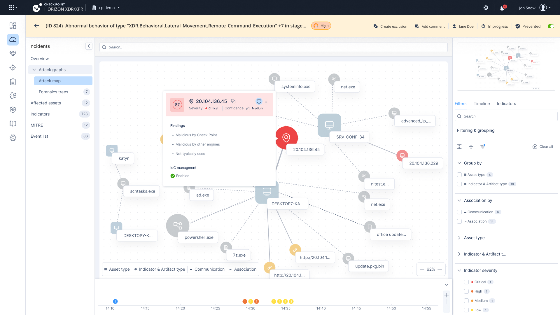
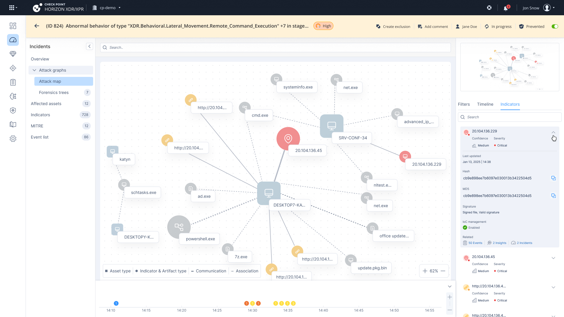
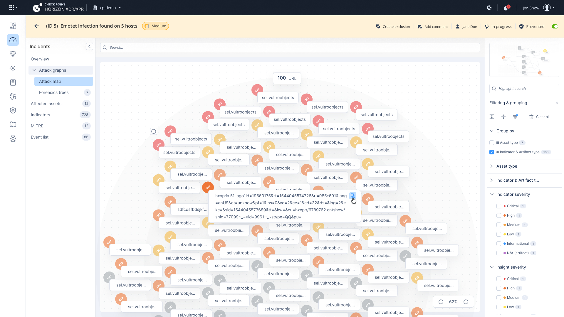
Attack Map – Visualizing Entity Relationships and Threat Flow
The attack map visualizes all entities involved in an attack and their connections.
Assets are displayed as squares in a neutral color, representing internal entities within the organization’s network.
Indicators & Artifacts are external entities shown as circles.
Indicators are malicious entities, color-coded by severity.
Artifacts are neutral entities, displayed in gray.
Each entity includes an icon that represents its type and a label displaying its name.
Connections represent insights (alerts) that form the structure of the attack; multiple insights can exist between the same two entities.
A mini-map is available to help users navigate large-scale maps that extend beyond the visible screen.
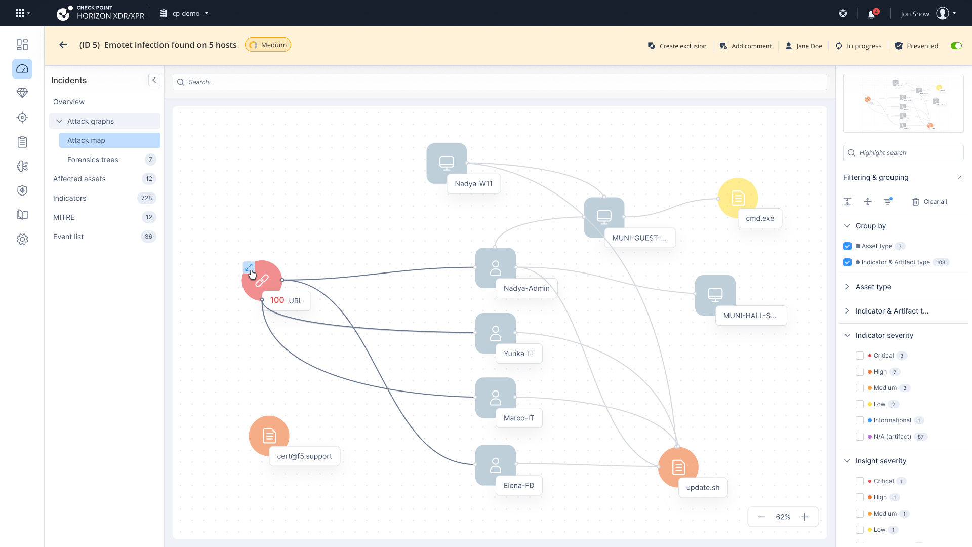
Entity Grouping Behavior – Improving Map Readability
Entities are grouped by asset type and indicator type to improve initial readability and reduce visual clutter.
Group Presentation: Each group includes an icon, a label summarizing the number of entities inside, and an arrow icon to expand or collapse the group.
Group Expansion: When a group contains many entities and is expanded, the map automatically zooms out, showing all elements in a compact, spaced layout to maintain clarity and context.
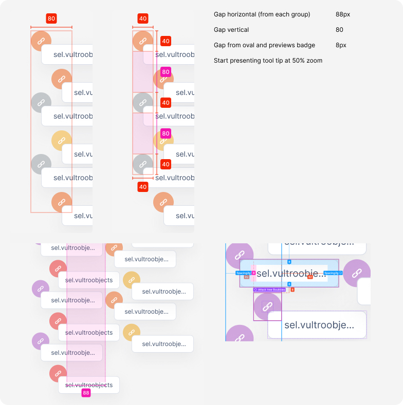
Spacing & Scaling Logic for Large Attack Maps
The smaller image defines the spacing system used when expanding large groups of entities within the attack map. It outlines the horizontal and vertical gaps (40–88px) between items to maintain readability and avoid visual overload. Additionally, a minimum zoom threshold (50%) is applied to start showing tooltips—ensuring labels remain legible without crowding the screen. These guidelines help maintain a clean structure and scalable layout even when displaying over 100 indicators, as seen in the main screen.

Tooltip Design – Spacing & Readability
This tooltip was designed to display long, complex values clearly—like suspicious URLs. I added detailed spacing guidelines to help developers implement it accurately and consistently, ensuring it stays readable across all screen sizes and zoom levels.
Usability Testing Summary – Attack Map
Participants: Testing was conducted with 3 users actively interacting with the attack map.
Navigation
The overall placement of elements was clear and easy to locate.
However, navigation to affected assets and related insights was not intuitive—existing links were either overlooked or unclear.
Grouping
Participants found that most maps were small and didn’t necessarily require grouping, which added unnecessary steps in some cases.
Investigation Capabilities
Pivot Options: Users expected the ability to pivot directly into Threat Hunting, Threat Intelligence, or to add an entity to the IOC list.
Indications: There were no visual indicators for isolated assets or actions that had already been taken for remediation.
Filters & Visual Cues
Counters: Filter counters lacked clarity and were sometimes overlooked.
Severity Differentiation: The distinction between indicator severity and insight severity was not clearly understood.
Overall Understanding
Chronological Flow: Users expected to see the sequence of events but noted this was missing.
Connectors: Connections between entities were unclear in terms of how they represented the progression or logic of the attack.
Key Fixes Implemented Based on Usability Feedback
Overall Understanding
Chronological flow: Adding timeline chart and list will allow users to understand better the attack.
Connectors: We’ve create a visual distinction between 2 different types of connections- communication & association. Communication is between 2 assets (devices & users) and association is between an asset and an indicators (like file, URL, process).
Grouping
Default Grouping: Removed default grouping as most maps appear small and do not require it.
Investigation
Pivot Options: Added links and actions in the tooltip for entities to pivot to Threat Hunting, Intelligence, and add to IOC.
Isolation Information: Added tooltip with information on the indications with information on the indication about the attack and if it was isolated.
Filters & Visual Cues
Counters: Removed counters from the title and presented them only within the filters.
Severity Differences: Displayed the number of insights to indicate the presence of a tooltip, where users can find severity information.